Element - Shortcodes: Button
Wednesday, June 25, 2014 12:19 AMShortcodes
[intense_button]
Description
Adds a clickable button to the page. Buttons can be used to redirect the user to another part of your site or to another site completely. There are many options to change the style of the button such as: rounding the corners, adding a gradient, changing the color, adding a 3D effect, and more.
Screenshots
Dialog
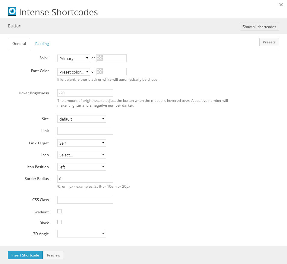
Attributes
| Attribute | Type | Dialog Title | Description | Default | Available Values |
|---|---|---|---|---|---|
| color | color_advanced | Color | primary | option colors - primary, error, info, inverse, muted, success, warning, link web color - hex, rgb, rgba, hsl, hsla, color name (see wikipedia web colors) | |
| font_color | color_advanced | Font Color | if left blank, either black or white will automatically be chosen | option colors - primary, error, info, inverse, muted, success, warning, link web color - hex, rgb, rgba, hsl, hsla, color name (see wikipedia web colors) | |
| hover_brightness | text | Hover Brightness | The amount of brightness to adjust the button when the mouse is hovered over. A positive number will make it lighter and a negative number darker. | -20 | |
| size | dropdown | Size | default | default - default mini - mini small - small medium - medium large - large | |
| link | text | Link | URL to direct the user to when clicked | ||
| target | link_target | Link Target | _self | _blank, _self, _parent, _top | |
| title | text | Title | title to show when the mouse is hovered over the button | ||
| icon | icon | Icon | see icon list in icon shortcode documentation | ||
| icon_position | dropdown | Icon Position | left | left - left right - right | |
| border_radius | border_radius | Border Radius | %, em, px - examples: 25% or 10em or 20px | ||
| class | text | CSS Class | |||
| gradient | checkbox | Gradient | 1 = true, 0 = false | ||
| block | checkbox | Block | 1 = true, 0 = false | ||
| angle_3d | dropdown | 3D Angle | -1 | -1 - None 0 - 0 45 - 45 90 - 90 135 - 135 180 - 180 225 - 225 270 - 270 315 - 315 | |
| size_3d | text | 3D Size | 3 | ||
| hover_size_3d | text | Hover 3D Size | 3 | ||
| padding_top | text | Padding Top | |||
| padding_bottom | text | Padding Bottom | |||
| padding_left | text | Padding Left | |||
| padding_right | text | Padding Right |
Compatibility
Rounded corners and 3D buttons aren't compatible with Internet Explorer 8 or earlier.
Examples
<style>
.intense.btn { margin: 3px; }
</style>
[intense_content_section]
[intense_promo_box size="mega"]
<h1>Buttons</h1>
Intense buttons come with many powerful options. Choose the size, color, icon, border radius, 3D angle, gradient, and more!
[intense_button size="large" color="primary" link="http://codecanyon.net/user/IntenseVisions?ref=IntenseVisions"]Buy Now[/intense_button]
[/intense_promo_box]
[/intense_content_section]
[intense_hr size="large" /]
[intense_content_section]
[intense_row]
[intense_column size="6"]
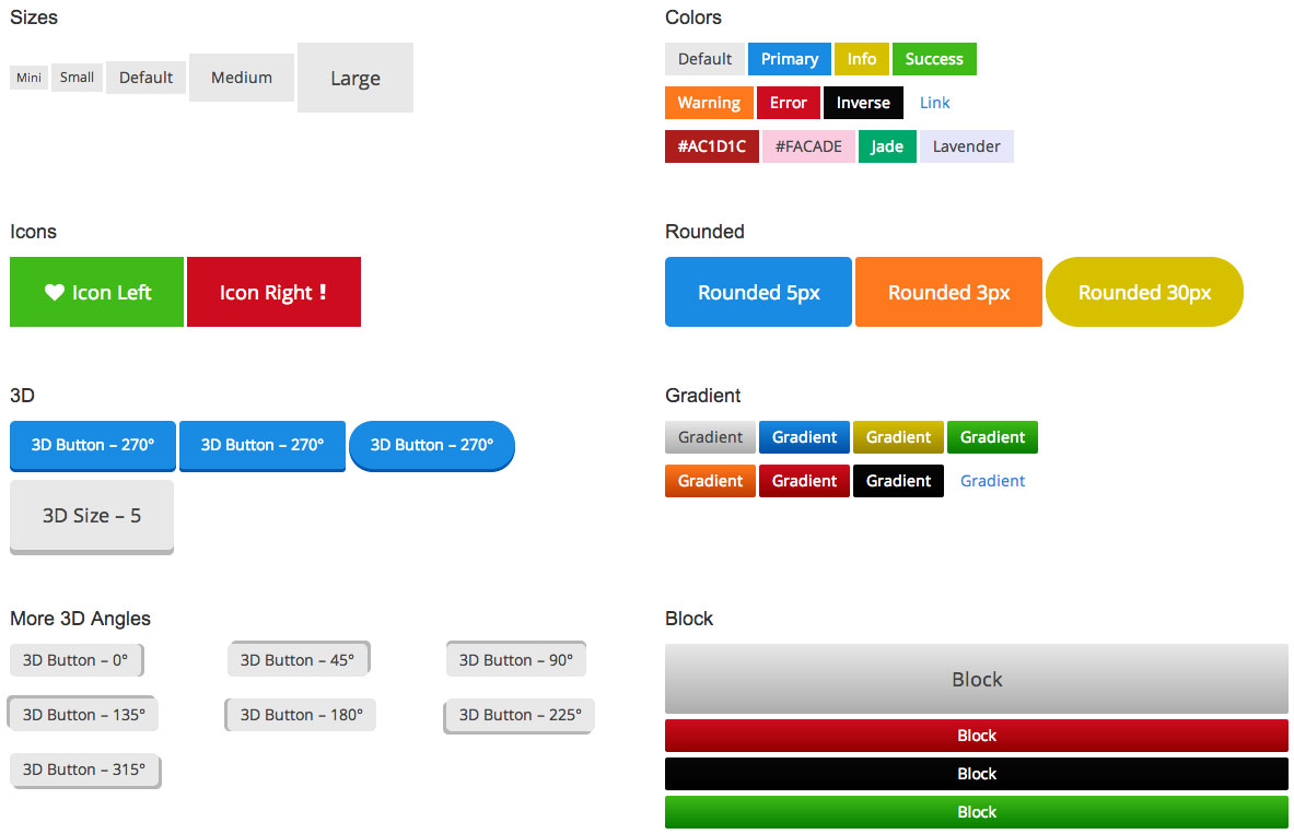
<h2>Sizes</h2>
[intense_button size="mini" color="muted"]Mini[/intense_button] [intense_button size="small" color="muted"]Small[/intense_button] [intense_button color="muted"]Default[/intense_button] [intense_button size="medium" color="muted"]Medium[/intense_button] [intense_button size="large" color="muted"]Large[/intense_button]
[/intense_column]
[intense_column size="6"]
<h2>Colors</h2>
[intense_button color="muted"]Muted[/intense_button] [intense_button color="primary"]Primary[/intense_button] [intense_button color="info"]Info[/intense_button] [intense_button color="success"]Success[/intense_button]
[intense_button color="warning"]Warning[/intense_button] [intense_button color="error"]Error[/intense_button] [intense_button color="inverse"]Inverse[/intense_button] [intense_button color="link"]Link[/intense_button]
[intense_button color="#AC1D1C"]#AC1D1C[/intense_button] [intense_button color="#FACADE"]#FACADE[/intense_button] [intense_button color="Jade"]Jade[/intense_button] [intense_button color="Lavender"]Lavender[/intense_button]
[/intense_column]
[/intense_row]
[intense_row]
[intense_column size="6"]
<h2>Icons</h2>
[intense_button size="large" color="success" icon="heart"]Icon Left[/intense_button] [intense_button size="large" icon="exclamation" color="error" icon_position="right"]Icon Right[/intense_button]
[/intense_column]
[intense_column size="6"]
<h2>Border Radius</h2>
[intense_button size="large" color="primary" border_radius="5"]Radius 5px[/intense_button] [intense_button size="large" color="warning" border_radius="3"]Radius 3px[/intense_button] [intense_button size="large" color="info" border_radius="30"]Radius 30px[/intense_button]
[/intense_column]
[/intense_row]
[intense_row]
[intense_column size="6"]
<h2>3D</h2>
[intense_button size="medium" color="primary" angle_3d="270" border_radius="5"]3D Button - 270°[/intense_button] [intense_button size="medium" angle_3d="270" color="primary" border_radius="3"]3D Button - 270°[/intense_button] [intense_button size="medium" angle_3d="270" color="primary" border_radius="30"]3D Button - 270°[/intense_button]
[intense_button angle_3d="270" border_radius="5" size_3d="5" size="large" color="muted"]3D Size - 5[/intense_button]
[/intense_column]
[intense_column size="6"]
<h2>Gradient</h2>
[intense_button gradient="1" border_radius="2" color="muted"]Gradient[/intense_button] [intense_button color="primary" gradient="1" border_radius="2"]Gradient[/intense_button] [intense_button color="info" gradient="1" border_radius="2"]Gradient[/intense_button] [intense_button color="success" gradient="1" border_radius="2"]Gradient[/intense_button]
[intense_button color="warning" gradient="1" border_radius="2"]Gradient[/intense_button] [intense_button color="error" gradient="1" border_radius="2"]Gradient[/intense_button] [intense_button color="inverse" gradient="1" border_radius="2"]Gradient[/intense_button] [intense_button color="link" gradient="1" border_radius="2"]Gradient[/intense_button]
[/intense_column]
[/intense_row]
[intense_row]
[intense_column size="2"]
<h2>More 3D Angles</h2>
[intense_button angle_3d="0" border_radius="5" color="muted"]3D Button - 0°[/intense_button]
[intense_button angle_3d="135" border_radius="5" color="muted"]3D Button - 135°[/intense_button]
[intense_button angle_3d="315" border_radius="5" color="muted"]3D Button - 315°[/intense_button]
[/intense_column]
[intense_column size="2"]
<h3> </h3>
[intense_button angle_3d="45" border_radius="5" color="muted"]3D Button - 45°[/intense_button]
[intense_button angle_3d="180" border_radius="5" color="muted"]3D Button - 180°[/intense_button]
[/intense_column]
[intense_column size="2"]
<h3> </h3>
[intense_button angle_3d="90" border_radius="5" color="muted"]3D Button - 90°[/intense_button]
[intense_button angle_3d="225" border_radius="5" color="muted"]3D Button - 225°[/intense_button]
[/intense_column]
[intense_column size="6"]
<h2>Block</h2>
[intense_button gradient="1" border_radius="2" block="1" size="large"]Block[/intense_button] [intense_button color="error" gradient="1" border_radius="2" block="1"]Block[/intense_button] [intense_button color="inverse" gradient="1" border_radius="2" block="1"]Block[/intense_button] [intense_button color="success" gradient="1" border_radius="2" block="1"]Block[/intense_button]
[/intense_column]
[/intense_row]
[/intense_content_section]