Layout - Shortcodes: Alert
Saturday, August 30, 2014 2:56 AMShortcodes
[intense_alert]
Description
Alerts are used to notify the user of information. Alerts are similar to the content box, promotional box, and content section but are more basic. You can choose the color, font color, to show a close button, to add a shadow underneath, and more.
Screenshots
Dialog
Attributes
| Attribute | Type | Dialog Title | Description | Default | Available Values | ||||||||||||||||||||||||||||||
|---|---|---|---|---|---|---|---|---|---|---|---|---|---|---|---|---|---|---|---|---|---|---|---|---|---|---|---|---|---|---|---|---|---|---|---|
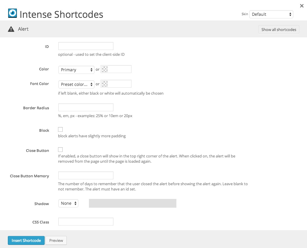
| id | text | ID | optional - used to set the client-side ID | ||||||||||||||||||||||||||||||||
| color | color_advanced | Color | primary | option colors - primary, error, info, inverse, muted, success, warning, link web color - hex, rgb, rgba, hsl, hsla, color name (see wikipedia web colors) | |||||||||||||||||||||||||||||||
| font_color | color_advanced | Font Color | if left blank, either black or white will automatically be chosen | option colors - primary, error, info, inverse, muted, success, warning, link web color - hex, rgb, rgba, hsl, hsla, color name (see wikipedia web colors) | |||||||||||||||||||||||||||||||
| border_radius | border_radius | Border Radius | %, em, px - examples: 25% or 10em or 20px | ||||||||||||||||||||||||||||||||
| block | checkbox | Block | block alerts have slightly more padding | 1 = true, 0 = false | |||||||||||||||||||||||||||||||
| close | checkbox | Close Button | If enabled, a close button will show in the top right corner of the alert. When clicked on, the alert will be removed from the page until the page is loaded again. | 1 = true, 0 = false | |||||||||||||||||||||||||||||||
| close_memory | text | Close Button Memory | The number of days to remember that the user closed the alert before showing the alert again. Leave blank to not remember. The alert must have an id set. | ||||||||||||||||||||||||||||||||
| shadow | shadow | Shadow |
| ||||||||||||||||||||||||||||||||
| class | text | CSS Class | |||||||||||||||||||||||||||||||||
| rtl | hidden | right-to-left |


Examples
[intense_content_section]
[intense_row]
[intense_column size="6"]
[intense_alert]
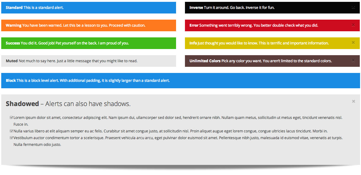
<strong>Standard</strong> This is a standard alert.
[/intense_alert]
[intense_alert color="warning"]
<strong>Warning</strong> You have been warned. Let this be a lesson to you. Proceed with caution.
[/intense_alert]
[intense_alert color="success"]
<strong>Success</strong> You did it. Good job! Pat yourself on the back. I am proud of you.
[/intense_alert]
[intense_alert color="muted"]
<strong>Muted</strong> Not much to say here. Just a little message that you might like to read.
[/intense_alert]
[/intense_column]
[intense_column size="6"]
[intense_alert color="inverse" close="1"]
<strong>Inverse</strong> Turn it around. Go back. Inverse it for fun.
[/intense_alert]
[intense_alert color="error" close="1"]
<strong>Error</strong> Something went terribly wrong. You better double check what you did.
[/intense_alert]
[intense_alert color="info" close="1"]
<strong>Info</strong> Just thought you would like to know. This is terrific and important information.
[/intense_alert]
[intense_alert color="#5B3D3C" close="1"]
<strong>Unlimited Colors</strong> Pick any color you want. You aren't limited to the standard colors.
[/intense_alert]
[/intense_column]
[/intense_row]
[intense_alert block="1"]
<strong>Block</strong> This is a block level alert. With additional padding, it is slightly larger than a standard alert.
[/intense_alert]
[intense_alert color="muted" shadow="3" block="1" close="1"]
[intense_lead]<strong>Shadowed</strong> - Alerts can also have shadows.[/intense_lead]
[intense_icon_list]
[intense_icon_list_item type="check" size="1" color="#848484"]
Lorem ipsum dolor sit amet, consectetur adipiscing elit. Nam ipsum dui, ullamcorper sed dolor sed, hendrerit ornare nibh. Nullam quam metus, sollicitudin ut metus eget, tincidunt venenatis nisl. Fusce in.
[/intense_icon_list_item]
[intense_icon_list_item type="check" size="1" color="#848484"]
Nulla varius libero at elit aliquam semper eu ac felis. Curabitur sit amet congue justo, at sollicitudin nisl. Proin aliquet augue eget lorem congue, congue ultricies lacus tincidunt. Morbi in.
[/intense_icon_list_item]
[intense_icon_list_item type="check" size="1" color="#848484"]
Vestibulum auctor condimentum tortor a scelerisque. Praesent vehicula arcu arcu, eget pulvinar dolor euismod sit amet. Pellentesque nibh justo, malesuada id euismod vitae, venenatis at turpis. Nulla fermentum odio justo.
[/intense_icon_list_item]
[/intense_icon_list]</br>
[/intense_alert]
[/intense_content_section]