Plugin Settings: Colors
Friday, August 8, 2014 1:52 AMDescription
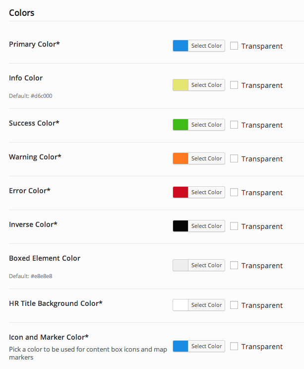
These colors are used as default values. You will find them on many shortcode dialog boxes.
Options Screenshot
Attributes
| Primary Color |
Pick a primary color (default: #1a8be2) This will be used as the primary color for certain items if no color is set in the shortcode |
| Info Color |
Pick an info color (default: #d6c000) When "Info" is selected in a color option dropdown, this will be the color that is used. |
| Success Color |
Pick a success color (default: #40ba18) When "Success" is selected in a color option dropdown, this will be the color that is used. |
| Warning Color |
Pick a warning color (default: #fe781e) When "Warning" is selected in a color option dropdown, this will be the color that is used. |
| Error Color |
Pick an error color (default: #ce0c1f) When "Error" is selected in a color option dropdown, this will be the color that is used. |
| Inverse Color |
Pick an inverse color (default: #070707) When "Inverse" is selected in a color option dropdown, this will be the color that is used. |
| Boxed Element Color |
Pick a background color for boxed elements (default: #e8e8e8) An example of a boxed element is a content box. |
| HR Title Background Color | Pick an hr title background color (default: #ffffff) |
| Icon and Marker Color | Pick a color to be used for content box icons and map markers (default: #1a8be2) |