Posts - Shortcodes: Custom Post Types
Monday, August 11, 2014 11:55 PMShortcodes
[intense_custom_post]
Description
Used to add a list of your custom post type posts to your page. Many themes/plugins include custom post types along with their item. We get a list of these items and allow you to select how you want to display the list.
Screenshots
Dialog
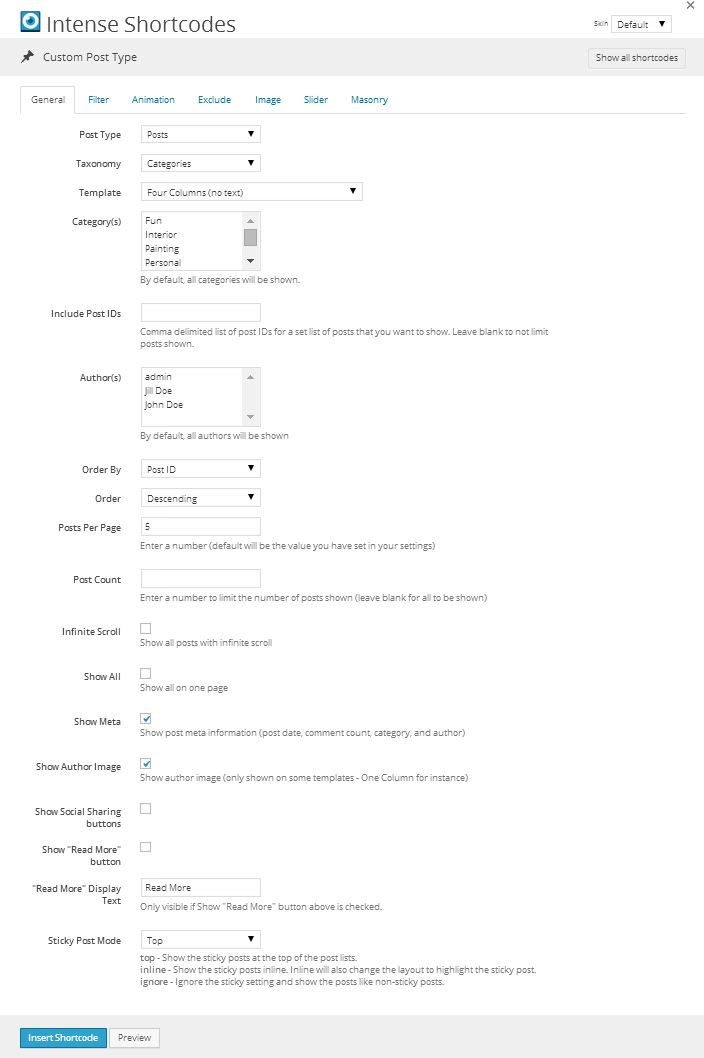
Attributes
| Attribute | Type | Dialog Title | Description | Default | Available Values | ||||||||||||||||||||||||||||||
|---|---|---|---|---|---|---|---|---|---|---|---|---|---|---|---|---|---|---|---|---|---|---|---|---|---|---|---|---|---|---|---|---|---|---|---|
| post_type | post_type | Post Type | |||||||||||||||||||||||||||||||||
| taxonomy | taxonomy | Taxonomy | |||||||||||||||||||||||||||||||||
| template | dropdown | Template | one | ||||||||||||||||||||||||||||||||
| type | deprecated | use template instead | |||||||||||||||||||||||||||||||||
| categories | category | Category(s) | By default, all categories will be shown. | ||||||||||||||||||||||||||||||||
| include_post_ids | text | Include Post IDs | Comma delimited list of post IDs for a set list of posts that you want to show. Leave blank to not limit posts shown. | ||||||||||||||||||||||||||||||||
| authors | author | Author(s) | By default, all authors will be shown | ||||||||||||||||||||||||||||||||
| order_by | dropdown | Order By | id | id - Post ID author - Author title - Title date - Date modified - Modified Date rand - Random Order comment_count - Comment Count | |||||||||||||||||||||||||||||||
| order | dropdown | Order | desc | desc - Descending asc - Ascending | |||||||||||||||||||||||||||||||
| posts_per_page | text | Posts Per Page | Enter a number (default will be the value you have set in your settings) | 10 | |||||||||||||||||||||||||||||||
| post_count | text | Post Count | Enter a number to limit the number of posts shown (leave blank for all to be shown) | ||||||||||||||||||||||||||||||||
| infinite_scroll | checkbox | Infinite Scroll | Show all posts with infinite scroll | 1 = true, 0 = false | |||||||||||||||||||||||||||||||
| show_all | checkbox | Show All | Show all on one page | 1 = true, 0 = false | |||||||||||||||||||||||||||||||
| show_meta | checkbox | Show Meta | Show post meta information (post date, comment count, category, and author) | 1 | 1 = true, 0 = false | ||||||||||||||||||||||||||||||
| show_author | checkbox | Show Author Image | Show author image (only shown on some templates - One Column for instance) | 1 | 1 = true, 0 = false | ||||||||||||||||||||||||||||||
| show_social_sharing | checkbox | Show Social Sharing buttons | 1 = true, 0 = false | ||||||||||||||||||||||||||||||||
| show_read_more | checkbox | Show "Read More" button | 1 = true, 0 = false | ||||||||||||||||||||||||||||||||
| read_more_text | text | "Read More" Display Text | Only visible if Show "Read More" button above is checked. | Read More | |||||||||||||||||||||||||||||||
| sticky_mode | dropdown | Sticky Post Mode | top - Show the sticky posts at the top of the post lists. inline - Show the sticky posts inline. Inline will also change the layout to highlight the sticky post. ignore - Ignore the sticky setting and show the posts like non-sticky posts. | top | ignore - Ignore inline - Inline top - Top | ||||||||||||||||||||||||||||||
| timeline_mode | dropdown | Mode | dual | dual - Dual left - Left right - Right center - Center | |||||||||||||||||||||||||||||||
| timeline_layout | deprecated | use template/timeline_mode instead | |||||||||||||||||||||||||||||||||
| timeline_order | deprecated | use template/timeline/order instead | |||||||||||||||||||||||||||||||||
| timeline_border_radius | border_radius | Timeline Border Radius | %, em, px - examples: 25% or 10em or 20px | ||||||||||||||||||||||||||||||||
| timeline_color | color_advanced | Color | Background color of timeline events | #efefef | option colors - primary, error, info, inverse, muted, success, warning, link web color - hex, rgb, rgba, hsl, hsla, color name (see wikipedia web colors) | ||||||||||||||||||||||||||||||
| timeline_showyear | checkbox | Show Year | Show year in timeline | 1 | 1 = true, 0 = false | ||||||||||||||||||||||||||||||
| timeline_readmore | deprecated | use show_read_more and read_more_text instead | |||||||||||||||||||||||||||||||||
| rtl | hidden | right-to-left | |||||||||||||||||||||||||||||||||
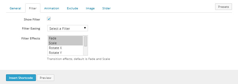
| show_filter | checkbox | Show Filter | 1 | 1 = true, 0 = false | |||||||||||||||||||||||||||||||
| filter_all_text | text | Filter All Display Text | All | ||||||||||||||||||||||||||||||||
| filter_easing | dropdown | Filter Easing | - Select a Filter smooth - Smooth snap - Snap windup - Wind Up windback - Wind Back | ||||||||||||||||||||||||||||||||
| filter_effects | dropdown | Filter Effects | Transition effects, default is Fade and Scale | fade,scale | fade - Fade scale - Scale rotateX - Rotate X rotateY - Rotate Y rotateZ - Rotate Z blur - Blur grayscale - Grayscale | ||||||||||||||||||||||||||||||
| animation_type | animation | Animation | Attention Seekers - bounce, flash, pulse, shake, swing, tada, wiggle, wobble Bouncing Entrances - bounceIn, bounceInDown, bounceInLeft, bounceInRight, bounceInUp, bounceInUpExpand Bouncing Exits - bounceOut, bounceOutDown, bounceOutLeft, bounceOutRight, bounceOutUp Expand - expandDown, expandLeft, expandRight, expandUp Fading Entrances - fadeIn, fadeInDown, fadeInDownBig, fadeInLeft, fadeInLeftBig, fadeInRight, fadeInRightBig, fadeInUp, fadeInUpBig Fading Exits - fadeOut, fadeOutDown, fadeOutDownBig, fadeOutLeft, fadeOutLeftBig, fadeOutRight, fadeOutRightBig, fadeOutUp, fadeOutUpBig Flippers - flip, flipInDownBackward, flipInDownForward, flipInLeftBackward, flipInLeftForward, flipInRightBackward, flipInRightForward, flipInUpBackward, flipInUpForward, flipInX, flipInY, flipOutX, flipOutY Lightspeed - lightSpeedIn, lightSpeedOut Repeating - beating, blinking, floating, flyAway, gearTurn, pulsating, squishBounce, throbbing, tossing Rotating Entrances - rotateIn, rotateInDownLeft, rotateInDownRight, rotateInUpLeft, rotateInUpRight Rotating Exits - rotateDown, rotateLeft, rotateOut, rotateOutDownLeft, rotateOutDownRight, rotateOutUpLeft, rotateOutUpRight, rotateRight, rotateUp Slide - slideDown, slideDownReturn, slideLeft, slideLeftReturn, slideRight, slideRightReturn, slideUp, slideUpReturn Specials - bombLeftOut, bombRightOut, flyIn, flyOut, foolishIn, foolishOut, hinge, holeOut, magic, pileDrive, rollIn, rollOut, springUp Static - openDownLeft, openDownLeftOut, openDownLeftReturn, openDownRight, openDownRightOut, openDownRightReturn, openUpLeft, openUpLeftOut, openUpLeftReturn, openUpRight, openUpRightOut, openUpRightReturn Swinging - swingInDownBackward, swingInDownForward, swingInLeftBackward, swingInLeftForward, swingInRightBackward, swingInRightForward, swingInUpBackward, swingInUpForward Tin - tinDownIn, tinDownOut, tinLeftIn, tinLeftOut, tinRightIn, tinRightOut, tinUpIn, tinUpOut Zoom - puffIn, puffOut, swap, swashIn, swashOut, twisterInDown, twisterInUp, vanishIn, vanishOut, zoomInBounce, zoomInGrow, zoomInShrink | ||||||||||||||||||||||||||||||||
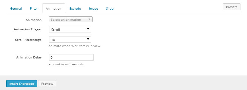
| animation_trigger | dropdown | Animation Trigger | scroll | scroll - Scroll hover - Hover click - Click delay - Delay | |||||||||||||||||||||||||||||||
| animation_scroll_percent | dropdown | Scroll Percentage | animate when % of item is in view | 10 | 0 - 0 10 - 10 20 - 20 30 - 30 40 - 40 50 - 50 60 - 60 70 - 70 80 - 80 90 - 90 100 - 100 | ||||||||||||||||||||||||||||||
| animation_delay | text | Animation Delay | amount in milliseconds | ||||||||||||||||||||||||||||||||
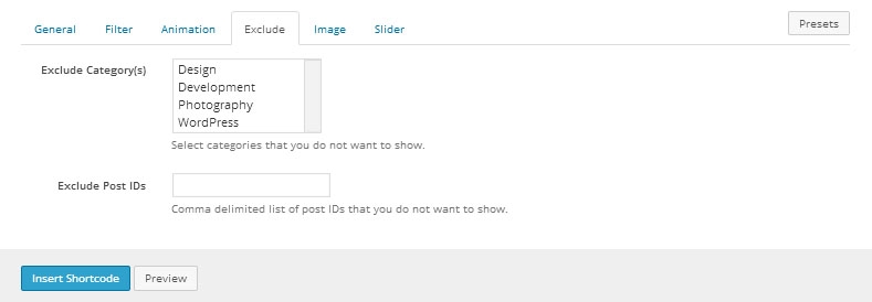
| exclude_categories | category | Exclude Category(s) | Select categories that you do not want to show. | ||||||||||||||||||||||||||||||||
| exclude_post_ids | text | Exclude Post IDs | Comma delimited list of post IDs that you do not want to show. | ||||||||||||||||||||||||||||||||
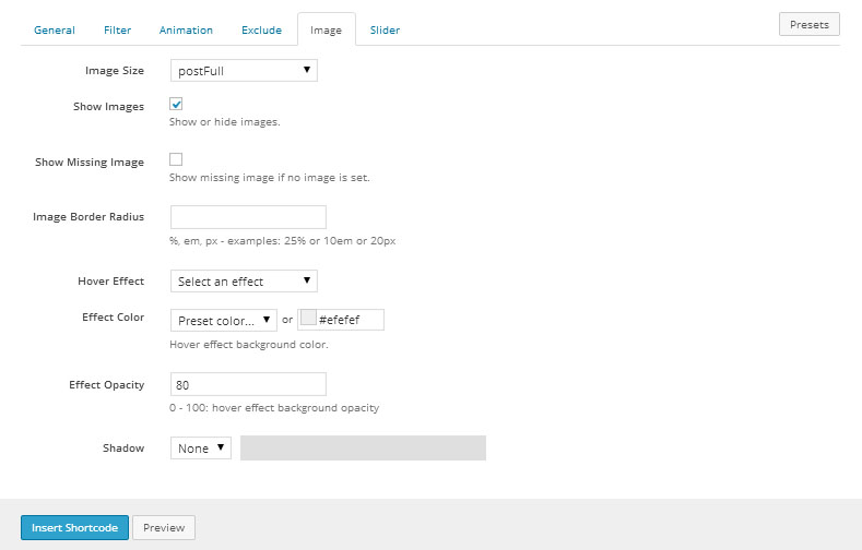
| image_size | image_size | Image Size | postFull | ||||||||||||||||||||||||||||||||
| show_images | checkbox | Show Images | Show or hide images. | 1 | 1 = true, 0 = false | ||||||||||||||||||||||||||||||
| show_missing_image | checkbox | Show Missing Image | Show missing image if no image is set. | 1 = true, 0 = false | |||||||||||||||||||||||||||||||
| image_border_radius | border_radius | Image Border Radius | %, em, px - examples: 25% or 10em or 20px | ||||||||||||||||||||||||||||||||
| hover_effect | dropdown | Hover Effect | - Select an effect 1 - Appear 2 - Slide Up 3 - Sqkwoosh 4 - Slide Side 5 - Cover 6 - Fall In 7 - Two-Step 8 - Move 9 - Scale 10 - Flip | ||||||||||||||||||||||||||||||||
| hover_effect_color | color_advanced | Effect Color | Hover effect background color. | #efefef | option colors - primary, error, info, inverse, muted, success, warning, link web color - hex, rgb, rgba, hsl, hsla, color name (see wikipedia web colors) | ||||||||||||||||||||||||||||||
| hover_effect_opacity | text | Effect Opacity | 0 - 100: hover effect background opacity | 80 | |||||||||||||||||||||||||||||||
| image_shadow | shadow | Shadow |
| ||||||||||||||||||||||||||||||||
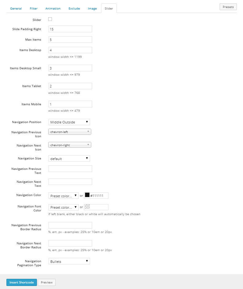
| is_slider | checkbox | Slider | 1 = true, 0 = false | ||||||||||||||||||||||||||||||||
| slide_padding_right | text | Slide Padding Right | 15 | ||||||||||||||||||||||||||||||||
| items | text | Max Items | 5 | ||||||||||||||||||||||||||||||||
| items_desktop | text | Items Desktop | window width <= 1199 | 4 | |||||||||||||||||||||||||||||||
| items_desktop_small | text | Items Desktop Small | window width <= 979 | 3 | |||||||||||||||||||||||||||||||
| items_tablet | text | Items Tablet | window width <= 768 | 2 | |||||||||||||||||||||||||||||||
| items_mobile | text | Items Mobile | window width <= 479 | 1 | |||||||||||||||||||||||||||||||
| navigation_position | dropdown | Navigation Position | middleoutside | - topleft - Top Left topcenter - Top Center topright - Top Right middleinside - Middle Inside middleoutside - Middle Outside bottomleft - Bottom Left bottomcenter - Bottom Center bottomright - Bottom Right | |||||||||||||||||||||||||||||||
| navigation_prev_icon | icon | Navigation Previous Icon | chevron-left | see icon list in icon shortcode documentation | |||||||||||||||||||||||||||||||
| navigation_next_icon | icon | Navigation Next Icon | chevron-right | see icon list in icon shortcode documentation | |||||||||||||||||||||||||||||||
| navigation_size | dropdown | Navigation Size | default | default - default mini - mini small - small medium - medium large - large | |||||||||||||||||||||||||||||||
| navigation_prev_text | text | Navigation Previous Text | |||||||||||||||||||||||||||||||||
| navigation_next_text | text | Navigation Next Text | |||||||||||||||||||||||||||||||||
| navigation_color | color_advanced | Navigation Color | #111111 | option colors - primary, error, info, inverse, muted, success, warning, link web color - hex, rgb, rgba, hsl, hsla, color name (see wikipedia web colors) | |||||||||||||||||||||||||||||||
| navigation_font_color | color_advanced | Navigation Font Color | if left blank, either black or white will automatically be chosen | option colors - primary, error, info, inverse, muted, success, warning, link web color - hex, rgb, rgba, hsl, hsla, color name (see wikipedia web colors) | |||||||||||||||||||||||||||||||
| navigation_prev_border_radius | border_radius | Navigation Previous Border Radius | %, em, px - examples: 25% or 10em or 20px | ||||||||||||||||||||||||||||||||
| navigation_next_border_radius | border_radius | Navigation Next Border Radius | %, em, px - examples: 25% or 10em or 20px | ||||||||||||||||||||||||||||||||
| navigation_pagination_type | dropdown | Navigation Pagination Type | bullets | - None bullets - Bullets numbers - Numbers | |||||||||||||||||||||||||||||||
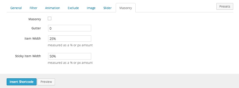
| is_masonry | checkbox | Masonry | 1 = true, 0 = false | ||||||||||||||||||||||||||||||||
| gutter | text | Gutter | |||||||||||||||||||||||||||||||||
| masonry_size | dropdown | Size | - 1 - 1 2 - 2 3 - 3 4 - 4 5 - 5 6 - 6 7 - 7 8 - 8 9 - 9 10 - 10 11 - 11 12 - 12 | ||||||||||||||||||||||||||||||||
| masonry_medium_size | dropdown | Medium Size | used to change the layout when viewed on medium devices - desktops (≥992px) | - 1 - 1 2 - 2 3 - 3 4 - 4 5 - 5 6 - 6 7 - 7 8 - 8 9 - 9 10 - 10 11 - 11 12 - 12 | |||||||||||||||||||||||||||||||
| masonry_small_size | dropdown | Small Size | used to change the layout when viewed on small devices - tablets (≥768px) | - 1 - 1 2 - 2 3 - 3 4 - 4 5 - 5 6 - 6 7 - 7 8 - 8 9 - 9 10 - 10 11 - 11 12 - 12 | |||||||||||||||||||||||||||||||
| masonry_extra_small_size | dropdown | Extra Small Size | used to change the layout when viewed on extra small devices - Phones (<768px) | - 1 - 1 2 - 2 3 - 3 4 - 4 5 - 5 6 - 6 7 - 7 8 - 8 9 - 9 10 - 10 11 - 11 12 - 12 | |||||||||||||||||||||||||||||||
| masonry_width | text | Item Manual Width | measured as a % or px amount | ||||||||||||||||||||||||||||||||
| masonry_sticky_size | dropdown | Sticky Item Size | - 1 - 1 2 - 2 3 - 3 4 - 4 5 - 5 6 - 6 7 - 7 8 - 8 9 - 9 10 - 10 11 - 11 12 - 12 | ||||||||||||||||||||||||||||||||
| masonry_sticky_medium_size | dropdown | Sticky Item Medium Size | used to change the layout when viewed on medium devices - desktops (≥992px) | - 1 - 1 2 - 2 3 - 3 4 - 4 5 - 5 6 - 6 7 - 7 8 - 8 9 - 9 10 - 10 11 - 11 12 - 12 | |||||||||||||||||||||||||||||||
| masonry_sticky_small_size | dropdown | Sticky Item Small Size | used to change the layout when viewed on small devices - tablets (≥768px) | - 1 - 1 2 - 2 3 - 3 4 - 4 5 - 5 6 - 6 7 - 7 8 - 8 9 - 9 10 - 10 11 - 11 12 - 12 | |||||||||||||||||||||||||||||||
| masonry_sticky_extra_small_size | dropdown | Sticky Item Extra Small Size | used to change the layout when viewed on extra small devices - Phones (<768px) | - 1 - 1 2 - 2 3 - 3 4 - 4 5 - 5 6 - 6 7 - 7 8 - 8 9 - 9 10 - 10 11 - 11 12 - 12 | |||||||||||||||||||||||||||||||
| masonry_sticky_width | text | Sticky Item Manual Width | measured as a % or px amount |


Templates
- one - Single column layout with image at top
- one_text_left - Single column layout with text on the left and image on the right
- one_text_right - Single column layout with text on the right and image on the left
- two - Two column layout, image only
- two_text - Two column layout with image on top and text underneath
- three - Three column layout, image only
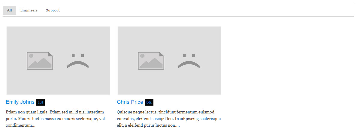
- three_text - Three column layout with image on top and text underneath
- four - Four column layout, image only
- four_text - Four column layout with image on top and text underneath
- masonry - a minimalistic layout well suited for masonry
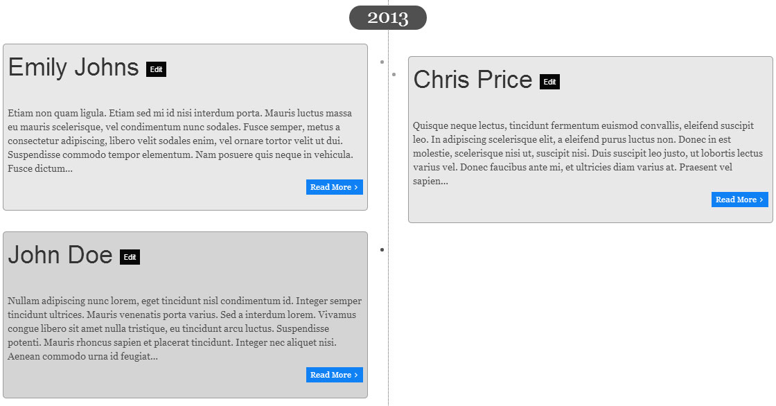
- timeline - Timeline
- timeline_text_left - Timeline with text on the left
- timeline_text_right - Timeline with text on the right
- timeline_text_only - Timeline only showing text
Examples
[intense_custom_post type="three_text" categories="engineers,support" show_filter="1" show_images="1" show_missing_image="1" filter_easing="smooth" filter_effects="fade,scale" post_type="intense_team" taxonomy="team_group" /]

[intense_custom_post type="timeline" timeline_mode="dual" timeline_layout="single" timeline_color="#e8e8e8" post_type="intense_team" taxonomy="team_group" /]