Layout - Shortcodes: Content Box
Wednesday, June 25, 2014 12:19 AMShortcodes
[intense_content_box]
Description
Adds a content box to the page. The content box can be customized in many different ways such as: background color, border, icon, layout, etc. You can choose to show the icon in several different locations: topcenter, topright, topleft, bottomcenter, bottomright, bottomleft, inside, insidetop, insidebottom.
Screenshots
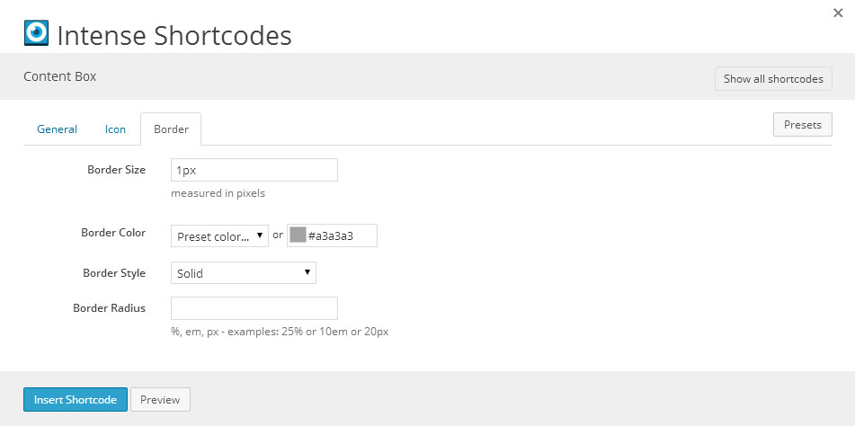
Dialog
Attributes
| Attribute | Type | Dialog Title | Description | Default | Available Values | ||||||||||||||||||||||||||||||
|---|---|---|---|---|---|---|---|---|---|---|---|---|---|---|---|---|---|---|---|---|---|---|---|---|---|---|---|---|---|---|---|---|---|---|---|
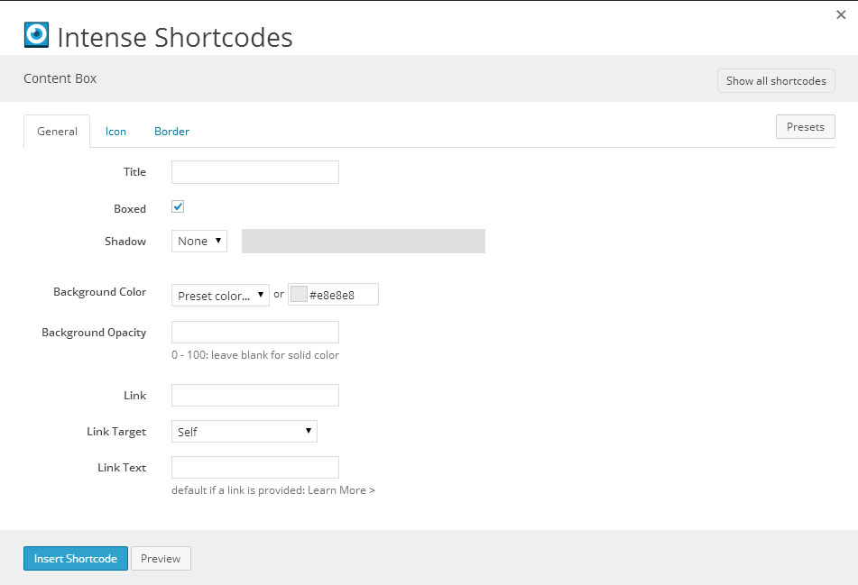
| title | text | Title | |||||||||||||||||||||||||||||||||
| boxed | checkbox | Boxed | 1 | 1 = true, 0 = false | |||||||||||||||||||||||||||||||
| shadow | shadow | Shadow |
| ||||||||||||||||||||||||||||||||
| background | color_advanced | Background Color | #eeeeee | option colors - primary, error, info, inverse, muted, success, warning, link web color - hex, rgb, rgba, hsl, hsla, color name (see wikipedia web colors) | |||||||||||||||||||||||||||||||
| background_opacity | text | Background Opacity | 0 - 100: leave blank for solid color | ||||||||||||||||||||||||||||||||
| link | text | Link | will show in the bottom right corner | ||||||||||||||||||||||||||||||||
| link_target | link_target | Link Target | _self | _blank, _self, _parent, _top | |||||||||||||||||||||||||||||||
| link_text | text | Link Text | default if a link is provided: Learn More > | ||||||||||||||||||||||||||||||||
| rtl | hidden | right-to-left | |||||||||||||||||||||||||||||||||
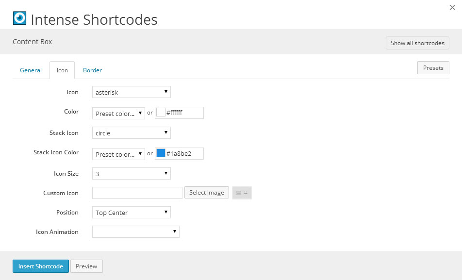
| icon | icon | Icon | asterisk | see icon list in icon shortcode documentation | |||||||||||||||||||||||||||||||
| icon_color | color_advanced | Color | #fff | option colors - primary, error, info, inverse, muted, success, warning, link web color - hex, rgb, rgba, hsl, hsla, color name (see wikipedia web colors) | |||||||||||||||||||||||||||||||
| icon_stack_type | icon | Stack Icon | circle | see icon list in icon shortcode documentation | |||||||||||||||||||||||||||||||
| icon_stack_color | color_advanced | Stack Icon Color | #1a8be2 | option colors - primary, error, info, inverse, muted, success, warning, link web color - hex, rgb, rgba, hsl, hsla, color name (see wikipedia web colors) | |||||||||||||||||||||||||||||||
| size | dropdown | Icon Size | 3 | 1 - 1 2 - 2 3 - 3 4 - 4 5 - 5 | |||||||||||||||||||||||||||||||
| custom_icon | image | Custom Icon | WordPress ID or any URL | ||||||||||||||||||||||||||||||||
| position | dropdown | Position | topcenter | topcenter - Top Center topright - Top Right topleft - Top Left bottomcenter - Bottom Center bottomright - Bottom Right bottomleft - Bottom Left inside - Inside insidetop - Inside Top insidebottom - Inside Bottom | |||||||||||||||||||||||||||||||
| animation | animation | Icon Animation | Attention Seekers - bounce, flash, pulse, shake, swing, tada, wiggle, wobble Bouncing Entrances - bounceIn, bounceInDown, bounceInLeft, bounceInRight, bounceInUp, bounceInUpExpand Bouncing Exits - bounceOut, bounceOutDown, bounceOutLeft, bounceOutRight, bounceOutUp Expand - expandDown, expandLeft, expandRight, expandUp Fading Entrances - fadeIn, fadeInDown, fadeInDownBig, fadeInLeft, fadeInLeftBig, fadeInRight, fadeInRightBig, fadeInUp, fadeInUpBig Fading Exits - fadeOut, fadeOutDown, fadeOutDownBig, fadeOutLeft, fadeOutLeftBig, fadeOutRight, fadeOutRightBig, fadeOutUp, fadeOutUpBig Flippers - flip, flipInDownBackward, flipInDownForward, flipInLeftBackward, flipInLeftForward, flipInRightBackward, flipInRightForward, flipInUpBackward, flipInUpForward, flipInX, flipInY, flipOutX, flipOutY Lightspeed - lightSpeedIn, lightSpeedOut Repeating - beating, blinking, floating, flyAway, gearTurn, pulsating, squishBounce, throbbing, tossing Rotating Entrances - rotateIn, rotateInDownLeft, rotateInDownRight, rotateInUpLeft, rotateInUpRight Rotating Exits - rotateDown, rotateLeft, rotateOut, rotateOutDownLeft, rotateOutDownRight, rotateOutUpLeft, rotateOutUpRight, rotateRight, rotateUp Slide - slideDown, slideDownReturn, slideLeft, slideLeftReturn, slideRight, slideRightReturn, slideUp, slideUpReturn Specials - bombLeftOut, bombRightOut, flyIn, flyOut, foolishIn, foolishOut, hinge, holeOut, magic, pileDrive, rollIn, rollOut, springUp Static - openDownLeft, openDownLeftOut, openDownLeftReturn, openDownRight, openDownRightOut, openDownRightReturn, openUpLeft, openUpLeftOut, openUpLeftReturn, openUpRight, openUpRightOut, openUpRightReturn Swinging - swingInDownBackward, swingInDownForward, swingInLeftBackward, swingInLeftForward, swingInRightBackward, swingInRightForward, swingInUpBackward, swingInUpForward Tin - tinDownIn, tinDownOut, tinLeftIn, tinLeftOut, tinRightIn, tinRightOut, tinUpIn, tinUpOut Zoom - puffIn, puffOut, swap, swashIn, swashOut, twisterInDown, twisterInUp, vanishIn, vanishOut, zoomInBounce, zoomInGrow, zoomInShrink | ||||||||||||||||||||||||||||||||
| border_size | text | Border Size | measured in pixels | 1px | |||||||||||||||||||||||||||||||
| border_color | color_advanced | Border Color | #eeeeee | option colors - primary, error, info, inverse, muted, success, warning, link web color - hex, rgb, rgba, hsl, hsla, color name (see wikipedia web colors) | |||||||||||||||||||||||||||||||
| border_style | border_style | Border Style | solid | ||||||||||||||||||||||||||||||||
| border_radius | border_radius | Border Radius | %, em, px - examples: 25% or 10em or 20px |


Examples
[intense_content_section]
[intense_row]
[intense_column size="4"]
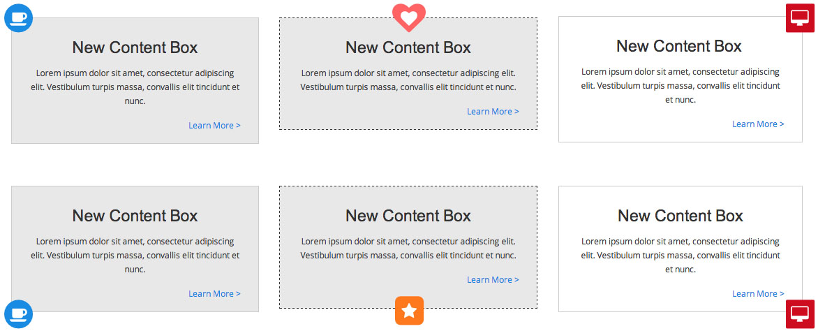
[intense_content_box icon="coffee" position="topleft" icon_stack_type="circle"
title="New Content Box
" link="http://www.google.com"]Lorem ipsum dolor sit amet, consectetur adipiscing elit. Vestibulum turpis massa, convallis elit tincidunt et nunc. [/intense_content_box]
[/intense_column]
[intense_column size="4"]
[intense_content_box icon="heart" boxed="1" position="topcenter" icon_stack_type="heart" icon_stack_color="#ff6363" border_style="dashed" border_color="#333" title="New Content Box
" link="http://www.google.com"]Lorem ipsum dolor sit amet, consectetur adipiscing elit. Vestibulum turpis massa, convallis elit tincidunt et nunc. [/intense_content_box]
[/intense_column]
[intense_column size="4"]
[intense_content_box icon="desktop" icon_stack_type="stop" position="topright" icon_stack_color="error" background="#ffffff" title="New Content Box
" link="http://www.google.com"]Lorem ipsum dolor sit amet, consectetur adipiscing elit. Vestibulum turpis massa, convallis elit tincidunt et nunc. [/intense_content_box]
[/intense_column]
[/intense_row]
[intense_row]
[intense_column size="4"]
[intense_content_box icon="coffee" boxed="0" position="bottomleft" icon_stack_type="circle" title="New Content Box"]Lorem ipsum dolor sit amet, consectetur adipiscing elit. Vestibulum turpis massa, convallis elit tincidunt et nunc. [/intense_content_box]
[/intense_column]
[intense_column size="4"]
[intense_content_box icon="star" boxed="0" position="bottomcenter" icon_stack_type="sign-blank" icon_stack_color="warning" border_style="dashed" border_color="#333" title="New Content Box"]Lorem ipsum dolor sit amet, consectetur adipiscing elit. Vestibulum turpis massa, convallis elit tincidunt et nunc. [/intense_content_box]
[/intense_column]
[intense_column size="4"]
[intense_content_box icon="desktop" boxed="0" icon_stack_type="stop" position="bottomright" icon_stack_color="error" background="#ffffff" title="New Content Box"]Lorem ipsum dolor sit amet, consectetur adipiscing elit. Vestibulum turpis massa, convallis elit tincidunt et nunc. [/intense_content_box]
[/intense_column]
[/intense_row]
[intense_hr size="large" /]
[intense_row]
[intense_column size="6"]
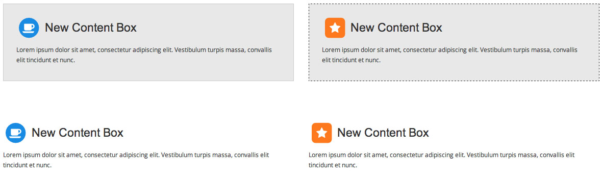
[intense_content_box icon="coffee" boxed="1" position="inside" icon_stack_type="circle" title="New Content Box"]Lorem ipsum dolor sit amet, consectetur adipiscing elit. Vestibulum turpis massa, convallis elit tincidunt et nunc. [/intense_content_box]
[/intense_column]
[intense_column size="6"]
[intense_content_box icon="star" boxed="1" position="inside" icon_stack_type="sign-blank" icon_stack_color="warning" border_style="dashed" border_color="#333" title="New Content Box"]Lorem ipsum dolor sit amet, consectetur adipiscing elit. Vestibulum turpis massa, convallis elit tincidunt et nunc. [/intense_content_box]
[/intense_column]
[/intense_row]
[intense_row]
[intense_column size="6"]
[intense_content_box icon="coffee" boxed="0" position="inside" icon_stack_type="circle" title="New Content Box" link="http://www.google.com"]Lorem ipsum dolor sit amet, consectetur adipiscing elit. Vestibulum turpis massa, convallis elit tincidunt et nunc. [/intense_content_box]
[/intense_column]
[intense_column size="6"]
[intense_content_box icon="star" boxed="0" position="inside" icon_stack_type="sign-blank" icon_stack_color="warning" border_style="dashed" border_color="#333" title="New Content Box" link="http://www.google.com"]Lorem ipsum dolor sit amet, consectetur adipiscing elit. Vestibulum turpis massa, convallis elit tincidunt et nunc. [/intense_content_box]
[/intense_column]
[/intense_row]
[/intense_content_section]