Layout - Shortcodes: Parallax Scene
Wednesday, June 25, 2014 12:19 AMShortcodes
[intense_parallax_scene]
Description
Add a parallax scene to your page. Parallax scenes are useful and fun. They offer you the ability to include multiple layers at different depths. Each layer moves depending on the position of the cursor and the depth of the layer, which makes for a rather interesting effect. The parallax scene's image background can even be parallax, which will add to the effect. One thing to note, the current version works best with images that do not have a hard edge, meaning that the image is a floating image with a transparent background. This is a current deficiency that we are working through.
Screenshots
Dialog
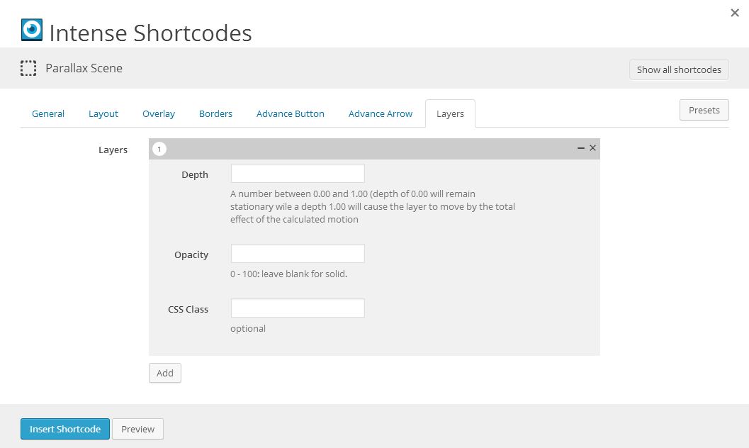
Attributes
intense_parallax_scene
| Attribute | Type | Dialog Title | Description | Default | Available Values |
|---|---|---|---|---|---|
| id | text | ID | optional | ||
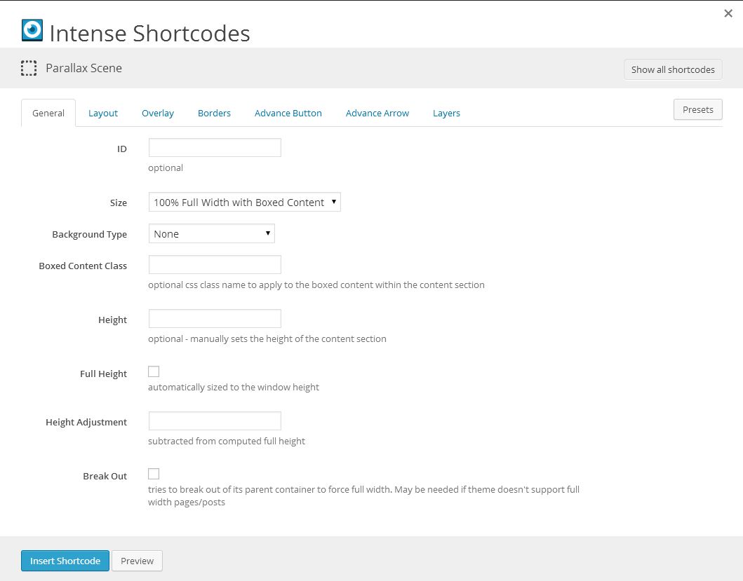
| size | dropdown | Size | fullboxed | fullboxed - 100% Full Width with Boxed Content full - 100% Full Width partial - Partial Width with Boxed Content | |
| background_type | dropdown | Background Type | - None color - Color image - Image video - WordPress Video webvideo - Youtube/Vimeo Video | ||
| image | image | Image | WordPress ID or any URL | ||
| imagesize | image_size | Image Size | large1600 | ||
| imagemode | dropdown | Background Mode | full | full - Full parallax - Parallax fixed - Parallax - Fixed repeat - Repeat repeat-x - Repeat-X repeat-y - Repeat-Y | |
| speed | text | Parallax Speed | Parallax mode only - default 2 | 2 | |
| background_color | color_advanced | Background Color | option colors - primary, error, info, inverse, muted, success, warning, link web color - hex, rgb, rgba, hsl, hsla, color name (see wikipedia web colors) | ||
| box_class | text | Boxed Content Class | optional css class name to apply to the boxed content within the content section | ||
| height | text | Height | optional - manually sets the height of the content section | ||
| full_height | checkbox | Full Height | automatically sized to the window height | 1 = true, 0 = false | |
| height_adjustment | text | Height Adjustment | subtracted from computed full height | ||
| breakout | checkbox | Break Out | tries to break out of its parent container to force full width. May be needed if theme doesn't support full width pages/posts | 1 = true, 0 = false | |
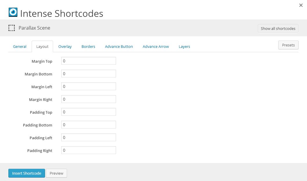
| margin_top | text | Margin Top | |||
| margin_bottom | text | Margin Bottom | |||
| margin_left | text | Margin Left | |||
| margin_right | text | Margin Right | |||
| padding_top | text | Padding Top | 25 | ||
| padding_bottom | text | Padding Bottom | 25 | ||
| padding_left | text | Padding Left | |||
| padding_right | text | Padding Right | |||
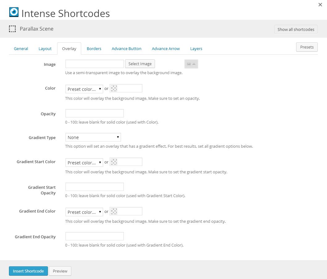
| overlay_image | image | Image | Use a semi-transparent image to overlay the background image. | WordPress ID or any URL | |
| overlay_color | color_advanced | Color | This color will overlay the background image. Make sure to set an opacity. | option colors - primary, error, info, inverse, muted, success, warning, link web color - hex, rgb, rgba, hsl, hsla, color name (see wikipedia web colors) | |
| overlay_opacity | text | Opacity | 0 - 100: leave blank for solid color (used with Color). | ||
| overlay_gradient | dropdown | Gradient Type | This option will set an overlay that has a gradient effect. For best results, set all gradient options below. | - None linear - Linear radial - Radial | |
| overlay_gradient_start_color | color_advanced | Gradient Start Color | This color will overlay the background image. Make sure to set the gradient start opacity. | option colors - primary, error, info, inverse, muted, success, warning, link web color - hex, rgb, rgba, hsl, hsla, color name (see wikipedia web colors) | |
| overlay_gradient_start_opacity | text | Gradient Start Opacity | 0 - 100: leave blank for solid color (used with Gradient Start Color). | ||
| overlay_gradient_end_color | color_advanced | Gradient End Color | This color will overlay the background image. Make sure to set the gradient end opacity. | option colors - primary, error, info, inverse, muted, success, warning, link web color - hex, rgb, rgba, hsl, hsla, color name (see wikipedia web colors) | |
| overlay_gradient_end_opacity | text | Gradient End Opacity | 0 - 100: leave blank for solid color (used with Gradient End Color). | ||
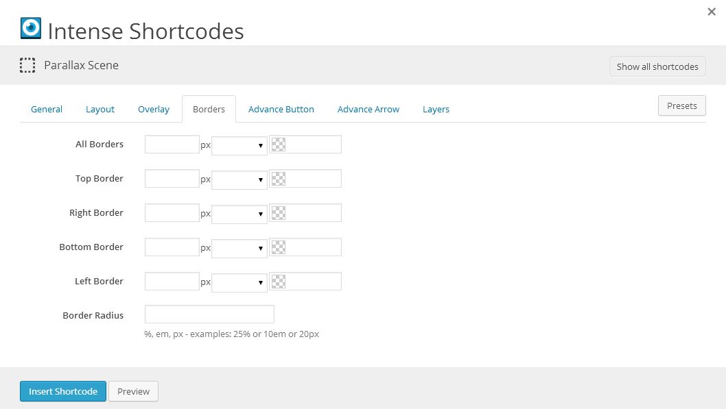
| border | border | All Borders | standard CSS border style | ||
| border_top | border | Top Border | standard CSS border style | ||
| border_right | border | Right Border | standard CSS border style | ||
| border_bottom | border | Bottom Border | standard CSS border style | ||
| border_left | border | Left Border | standard CSS border style | ||
| border_radius | border_radius | Border Radius | %, em, px - examples: 25% or 10em or 20px | ||
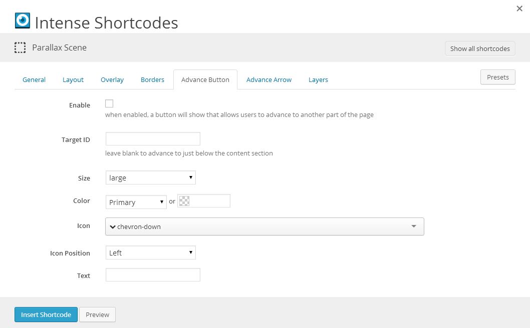
| show_advance | checkbox | Enable | when enabled, a button will show that allows users to advance to another part of the page | 1 = true, 0 = false | |
| advance_target_id | text | Target ID | leave blank to advance to just below the content section | ||
| advance_size | dropdown | Size | large | default - default mini - mini small - small medium - medium large - large | |
| advance_color | color_advanced | Color | primary | option colors - primary, error, info, inverse, muted, success, warning, link web color - hex, rgb, rgba, hsl, hsla, color name (see wikipedia web colors) | |
| advance_icon | icon | Icon | chevron-down | see icon list in icon shortcode documentation | |
| advance_icon_position | dropdown | Icon Position | left | left - Left right - Right | |
| advance_text | text | Text | |||
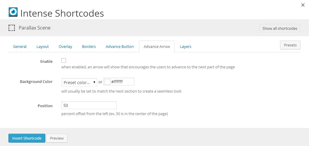
| show_advance_arrow | checkbox | Enable | when enabled, an arrow will show that encourages the users to advance to the next part of the page | 1 = true, 0 = false | |
| advance_arrow_background_color | color_advanced | Background Color | will usually be set to match the next section to create a seemless look | #fff | option colors - primary, error, info, inverse, muted, success, warning, link web color - hex, rgb, rgba, hsl, hsla, color name (see wikipedia web colors) |
| advance_arrow_position | text | Position | percent offset from the left (ex. 50 is in the center of the page) | 50 |
intense_parallax_scene_layer
| Attribute | Type | Dialog Title | Description | Default | Available Values |
|---|---|---|---|---|---|
| layer_depth | decimal | Depth | A number between 0.00 and 1.00 (depth of 0.00 will remain stationary wile a depth 1.00 will cause the layer to move by the total effect of the calculated motion | ||
| layer_opacity | number | Opacity | 0 - 100: leave blank for solid | ||
| layer_class | text | CSS Class | optional |
Compatibility
Theme Compatibility
The parallax scene has three different sizing options:
- fullboxed (default) - 100% Full Width with Boxed Content
- full - 100% Full Width
- partial - Partial Width with Boxed Content
Fullboxed will make the parallax scene the entire width of its container with boxed content inside. Full will make the parallax scene the entire width of its container without a box around the content. Partial will put a box around the parallax scene itself making the parallax scene the size of the box.
In the HTML markup created by the [intense_parallax_scene] shortcode, there are two different HTML elements at play when it comes to the width of the parallax scene. The content section itself is an HTML section tag with at least two CSS classes (.intense and .content-section). Depending on the size option, there may also be an additional div used for boxing the content. The boxed div will have two CSS classes as well (.intense and .container).
The key to getting the box to look correctly within a theme is to make sure the .container class has the correct width for your theme. This class is standard for Twitter Bootstrap and may already be styled if the theme uses Bootstrap.
Another possibility is that your theme uses a different CSS class for this same purpose. If this is the case, you can set the CSS class name under the shortcodes options.
If the theme doesn't use Twitter Bootstrap and it doesn't define a similar class for the boxed content, you can manually set the width of the .container CSS class under the CSS code options.
Example:
.intense.container {
    width: 940px;
}

@media (min-width: 1200px) {
    .intense.container {
        width: 1170px;
    }
}

@media (min-width: 768px) and (max-width: 979px) {
    .intense.container {
         width: 724px;
    }
}

@media (max-width: 767px) {
    .intense.container {
         width: auto;
    }
}
Examples
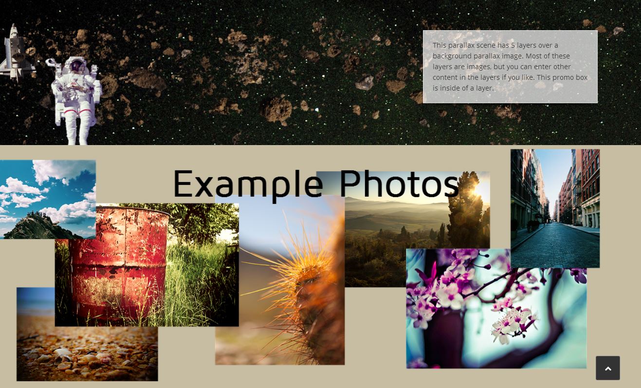
[intense_parallax_scene size="full" background_type="image" image="2718" imagemode="parallax" height="300"]
    [intense_parallax_scene_layer layer_depth="0.30"]
        [intense_image image="368" size="Full" title="asteroid-belt"]
    [/intense_parallax_scene_layer]
    [intense_parallax_scene_layer layer_depth="0.20"]
        [intense_image image="2727" size="Full" title="Spaceshuttle"]
    [/intense_parallax_scene_layer]
    [intense_parallax_scene_layer layer_depth="0.80"]
        [intense_image image="2711" size="Full" title="asteroid-belt"]
    [/intense_parallax_scene_layer]
    [intense_parallax_scene_layer layer_depth="0.10"]
        <div style="padding-left:40px;">[intense_image image="2726" size="Full" title="astronaut"]</div>
    [/intense_parallax_scene_layer]
    [intense_parallax_scene_layer layer_depth="0.00"]
        [intense_content_section]
            [intense_row padding_top="0"]
                [intense_column size="8" medium_size="8"][/intense_column]
                [intense_column size="4" medium_size="4"]
                    [intense_promo_box shadow="8" background_color="#ffffff" background_opacity="70"]
                        This parallax scene has 5 layers over a background parallax image. Most of these layers are images, but you can enter other content in the layers if you like. This promo box is inside of a layer.
                    [/intense_promo_box]
                [/intense_column]
            [/intense_row]
        [/intense_content_section]
    [/intense_parallax_scene_layer]
[/intense_parallax_scene]

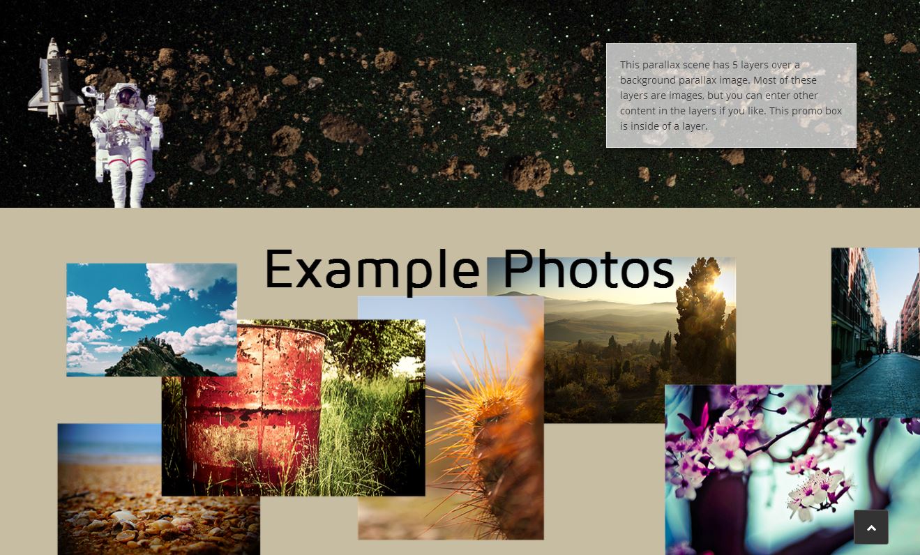
[intense_parallax_scene size="full" background_type="color" background_color="#c7bda3" height="500" advance_arrow_background_color="#ffffff"]
    [intense_parallax_scene_layer layer_depth="0.20"]
        [intense_image image="2734" size="large1600" title="layer 4"]
    [/intense_parallax_scene_layer]
    [intense_parallax_scene_layer layer_depth="0.30"]
        [intense_image image="2733" size="large1600" title="layer 3"]
    [/intense_parallax_scene_layer]
    [intense_parallax_scene_layer layer_depth="0.50"]
        [intense_image image="2732" size="large1600" title="layer 2"]
    [/intense_parallax_scene_layer]
    [intense_parallax_scene_layer layer_depth="0.60"]
        [intense_image image="2731" size="large1600" title="layer 1"]
    [/intense_parallax_scene_layer]
    [intense_parallax_scene_layer layer_depth="0.10"]
        <center>[intense_heading font_size="80" line_height="90" font_color="#000000" align="center" font_weight="700" margin_top="0"]Example Photos[/intense_heading]</center>
    [/intense_parallax_scene_layer]
[/intense_parallax_scene]