Typography - Shortcodes: Popover
Wednesday, June 25, 2014 12:19 AMShortcodes
[intense_popover]
Description
Allows you to add a popover to content of your choice. Popovers are like tooltips but with more information.
Screenshots
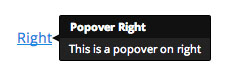
Dialog
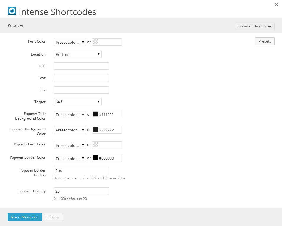
Attributes
| Attribute | Type | Dialog Title | Description | Default | Available Values |
|---|---|---|---|---|---|
| font_color | color_advanced | Font Color | option colors - primary, error, info, inverse, muted, success, warning, link web color - hex, rgb, rgba, hsl, hsla, color name (see wikipedia web colors) | ||
| location | dropdown | Location | bottom | top - Top right - Right bottom - Bottom left - Left | |
| title | text | Title | |||
| text | text | Text | |||
| link | text | Link | |||
| link_target | link_target | Target | _self | _blank, _self, _parent, _top | |
| tooltip_title_background_color | color_advanced | Popover Title Background Color | #111111 | option colors - primary, error, info, inverse, muted, success, warning, link web color - hex, rgb, rgba, hsl, hsla, color name (see wikipedia web colors) | |
| tooltip_background_color | color_advanced | Popover Background Color | #222222 | option colors - primary, error, info, inverse, muted, success, warning, link web color - hex, rgb, rgba, hsl, hsla, color name (see wikipedia web colors) | |
| tooltip_font_color | color_advanced | Popover Font Color | white | option colors - primary, error, info, inverse, muted, success, warning, link web color - hex, rgb, rgba, hsl, hsla, color name (see wikipedia web colors) | |
| tooltip_border_color | color_advanced | Popover Border Color | #000000 | option colors - primary, error, info, inverse, muted, success, warning, link web color - hex, rgb, rgba, hsl, hsla, color name (see wikipedia web colors) | |
| tooltip_border_radius | border_radius | Popover Border Radius | 2px | %, em, px - examples: 25% or 10em or 20px | |
| tooltip_opacity | text | Popover Opacity | 0 - 100: default is 20 | 20 |
Examples
[intense_popover title="Popover Bottom" location="bottom" text="This is a popover on bottom"]bottom[/intense_popover]